The inside story of how Weller Pools won a giant contract by transforming their basic PowerPoint presentation into a dynamic visual masterpiece.
Weller Pools has been in the aquatic construction industry for over 35 years, creating some of the country’s best known and loved swimming pools and water parks. However, their PowerPoint presentations didn’t match up to the standards of their pools!
So in February 2010 the Orlando-based aquatic developer turned to The Presentation Team to help them improve their PowerPoint presentation to win the business of a Florida-based preparatory school. The key objective of the presentation was to effectively communicate the advantages of the Myrtha Pool Technology, a cutting-edge material that is being used in many new swimming pools.
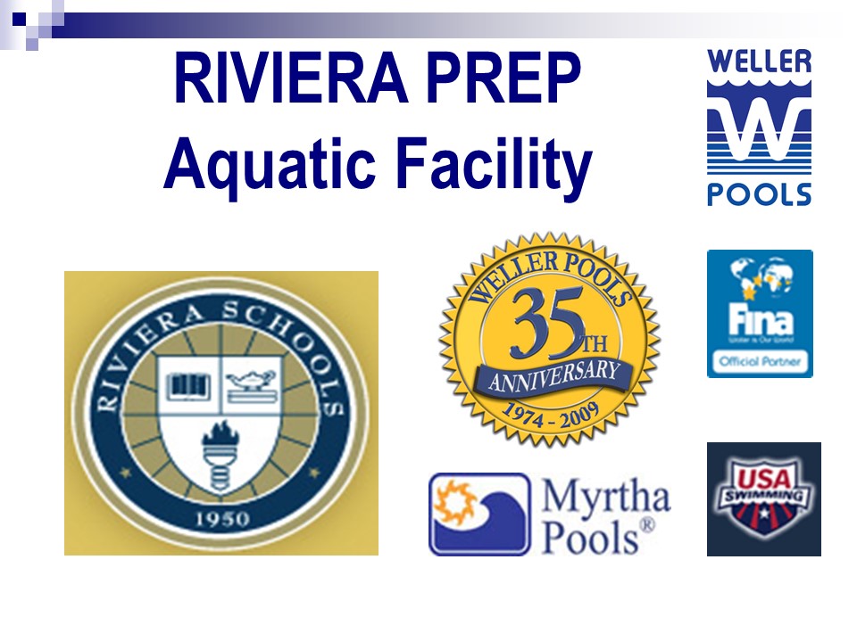
Weller Pool’s existing 38-page PowerPoint was heavy on text/bullet points and lacked a consistent look-and-feel. Weller had a limited budget and short time-frame, so they engaged The Presentation Team to transform a basic PowerPoint into a get-noticed masterpiece.
Weller was presenting to a small audience of five people. The visual design needed to be bold, graphical, yet easy-to-read.Our design strategy focused on creating a look-and-feel that reflected Weller Pool’s brand and identity while involving elements of aquatics and technology. The six-hour project involved…
- Development of a custom professional template (title and body masters), that reflected Weller’s company brand, while integrating their existing PowerPoint content.
- Re-working the overall look-and-feel of the presentation (colors, fonts, layout) for a more polished look.
- Clean and professional imagery/graphics (portfolio, schematics, people, concept art, etc.).
- Clutter-reducing techniques and presentation strategies to create a “cleaner” look with greater effectiveness.
- Clean and conservative slide transition effects (fades and wipe effect).
- Professional fonts/typography to ensure consistent playback on different computer systems.
- Consulting and collaboration to help Weller Pools to further develop and present new ideas.
 |
 |
|
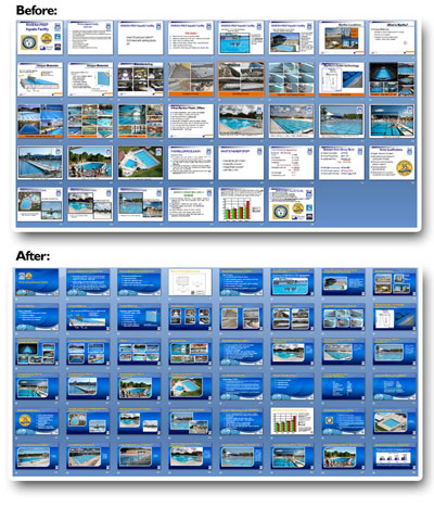
Before: |
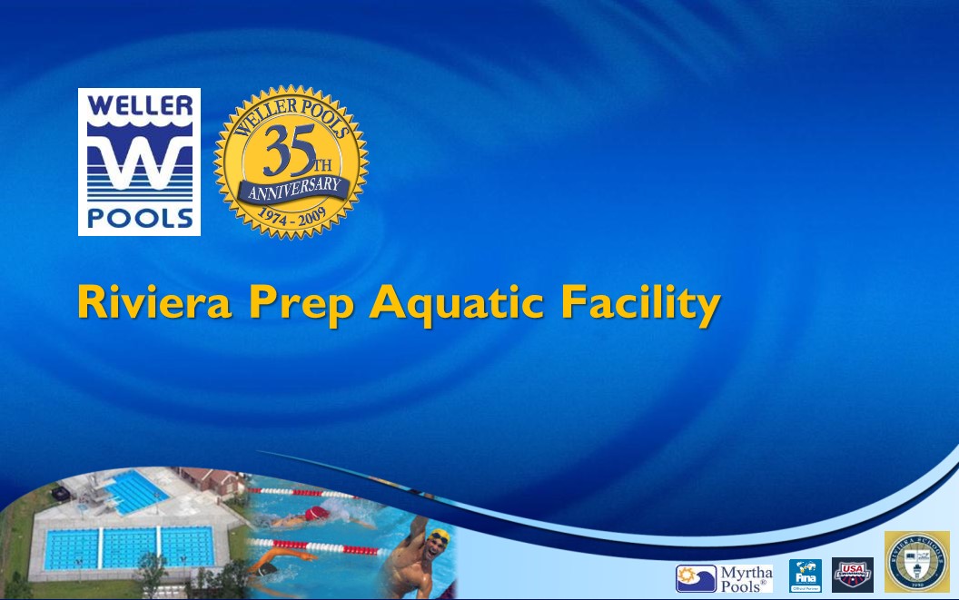
After: Our makeover included development of a new high-tech blue water-drop image background template image (developed in Photoshop) in 16×9 aspect ratio. This widescreen format has become increasingly popular on monitors and laptops and conference room projectors. The body master template featured a flowing bottom arc image integrating colorful and dynamic photos of two of Weller Pool’s projects. Their partner company logo were offset to the right of the page, and the project was prominently featured in left-justified vertically centered on the page in 40-point Gil Sans Font. |
 |
 |
| Before: This original showcased the four-step process of Backfilling. The rectangular images were inconsistently sized and did not integrate any elements (typeface, logo or graphics) from the master template. “Backfilling Process” placed on the bottom conveyed the concept of an afterthought rather than a bold title. |
After: The revised slide maintained the four graphics, with a rounded diagonal corner picture style, to add depth and professionalism. By simply shrinking the photos 10%, the slide gained a level of breathing space, allowing the title to be repositioned at the top in a bold bright orange Gil Sans font, and the logo in a consistent bottom right placement. |
 |
 |
|
Before: |
After: |
 |
 |
| Before: The cost savings of Myrtha is clear and well-documented. But presenting the information in a green and red bar chart incurred images of Christmas! And all too often, red is information. The textwas overwhelming and small, and the costkey message was diffused. |
After: To more effectively communicate the cost savings of Myrtha, we reduced the scale of the bar chart, allowing more space on the top and bottom. The colors were revised to two shades of blue, and the cost savings were posted above the bars as separate text elements (not within the bar chart) more prominently at 28 points. |
After just four days and three rounds of edits, the presentation looked great! Weller Pools executives rehearsed and refined their delivery with presentation skills coach David Greenberg….then presented to their audience…and won the job! Weller Pools now has a winning presentation and great presentation skills presentation thanks in part to the experts at The Presentation Team!